ClucksFried Chicken
Bold bilingual brand identity and packaging for a new fried chicken concept in the African market.
Project story
Not Just Another Chicken Spot
The Brief
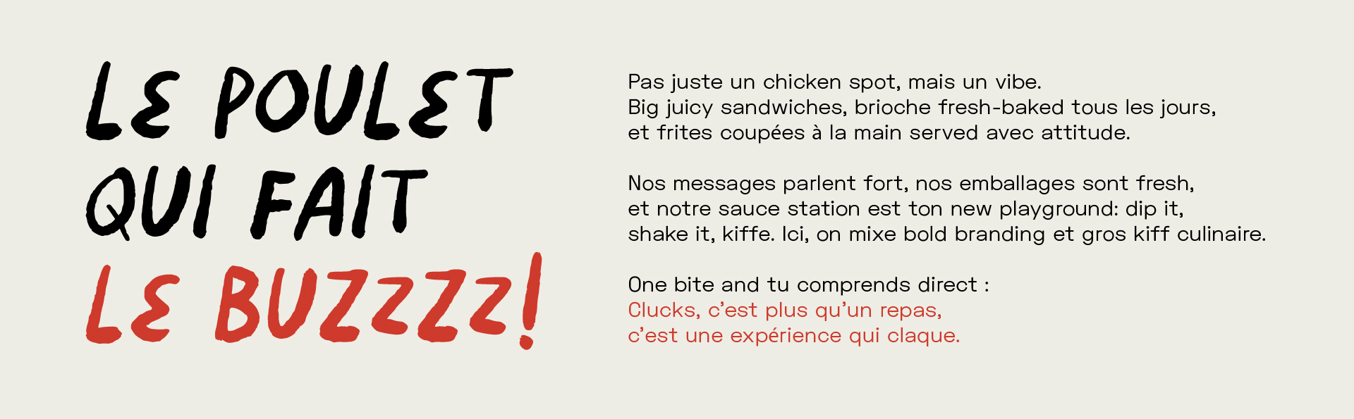
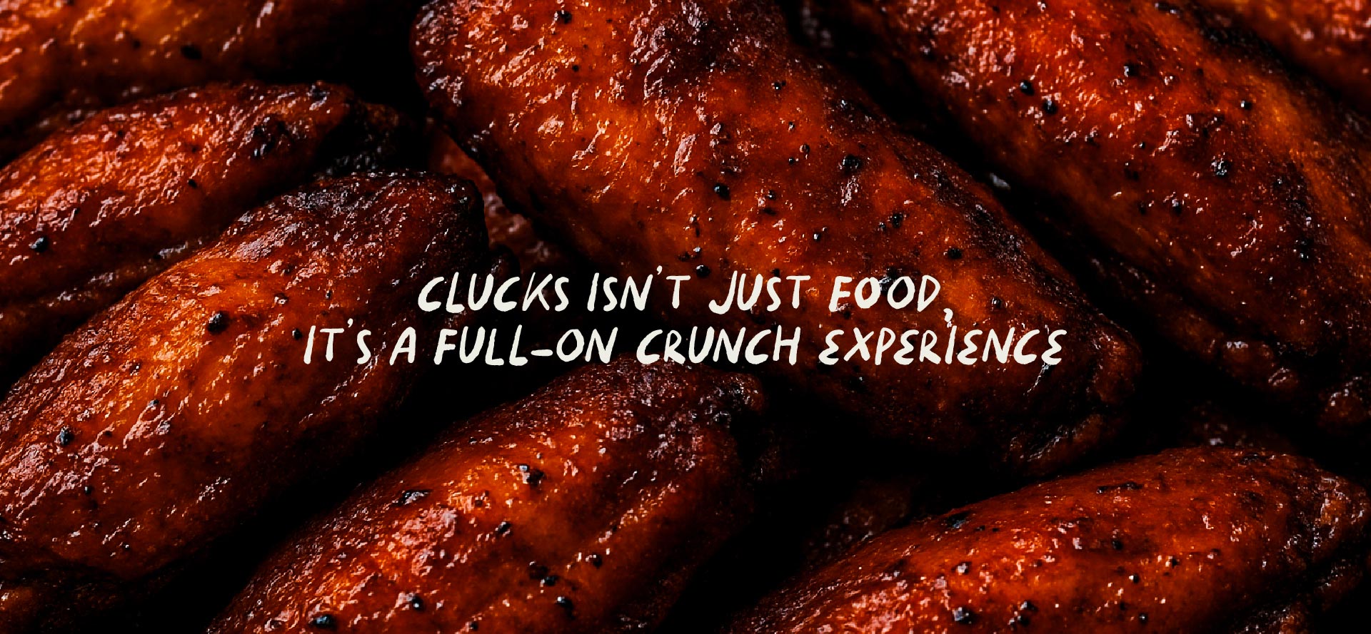
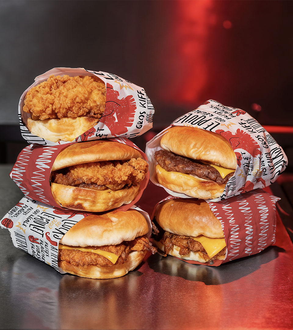
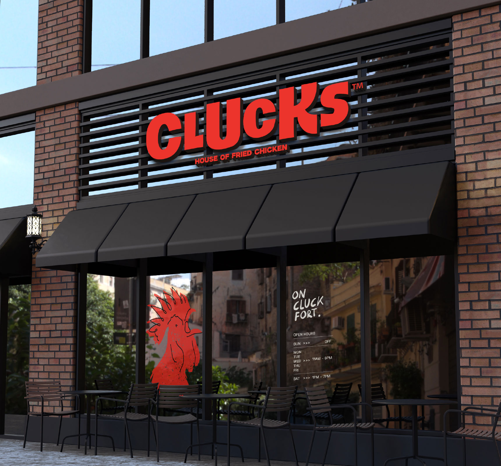
Clucks Fried Chicken is a new chicken-based concept with special recipes, created to take the African market by storm. The brief was clear from the start: Clucks should not just be another chicken spot, but a vibe. The menu delivers on that promise with big juicy sandwiches, daily fresh-baked brioche, and hand-cut fries served with attitude. The sauce station is meant to be a playground: dip it, shake it, enjoy. Communication needed to be loud, in both French and English, and packaging needed to feel fresh. The market added its own challenge. Concepts like this are still relatively new for the audience, so the brand had to be accessible enough to welcome first-time customers and bold enough to be remembered. Menu Mechanics, Kook’s creative partner, developed the concept, and Kook built the identity around it. The goal: one bite, and you get it. Clucks serves more than food; it serves an experience.
- Client
- Menu Mechanics
- Year
- 2025
- Industry
- Food & Beverage
The Identity
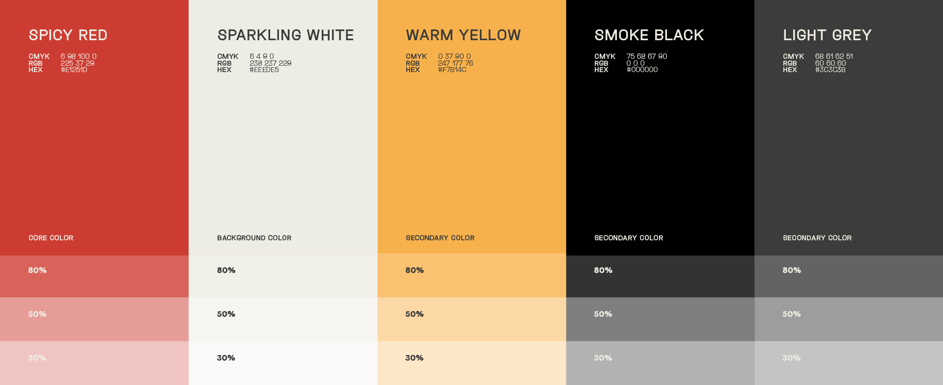
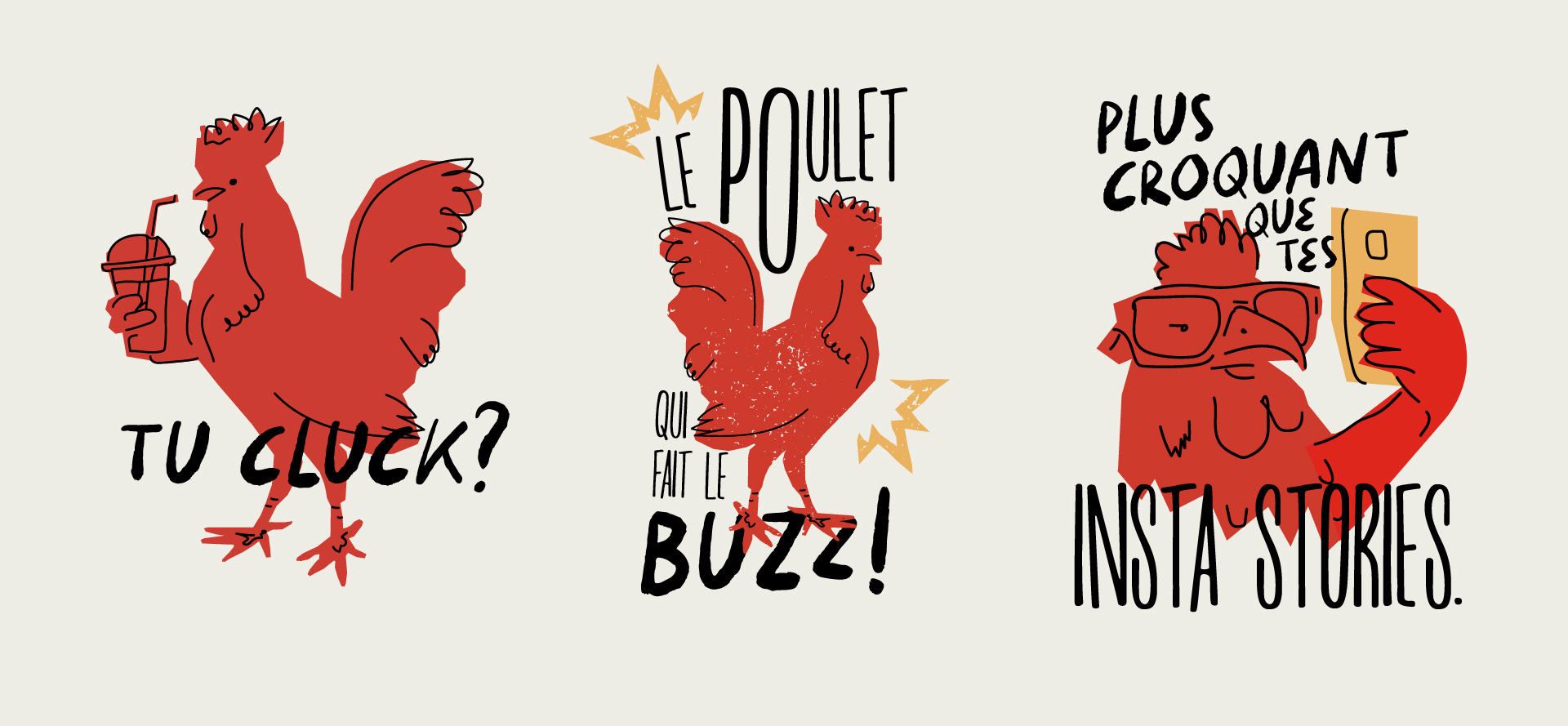
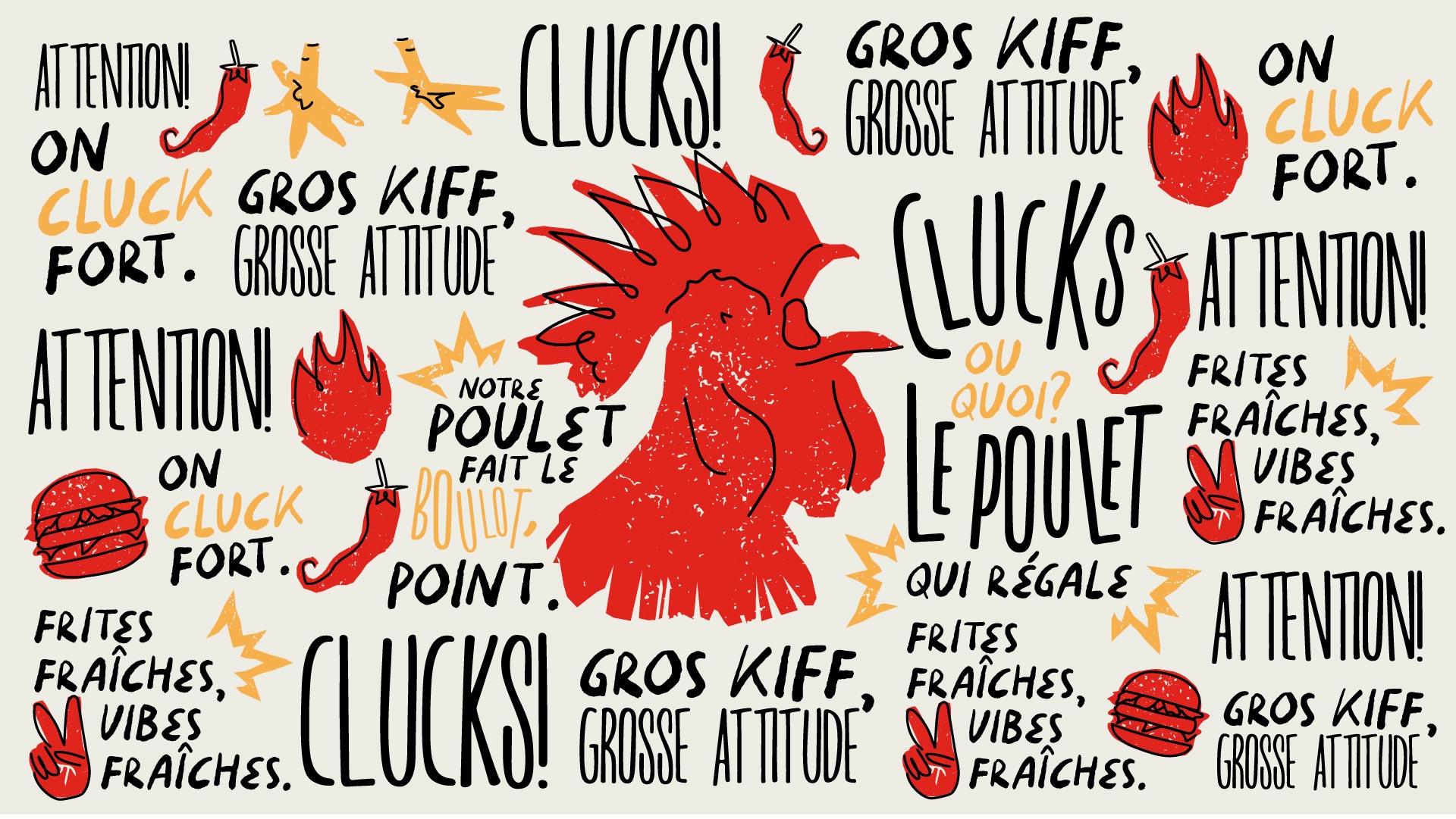
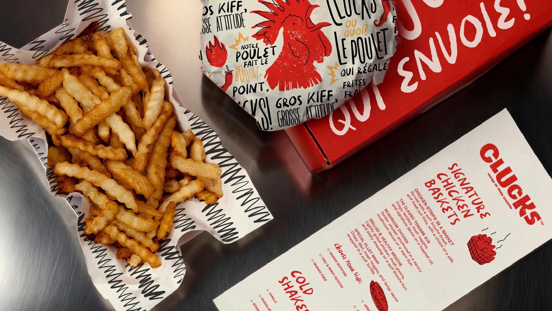
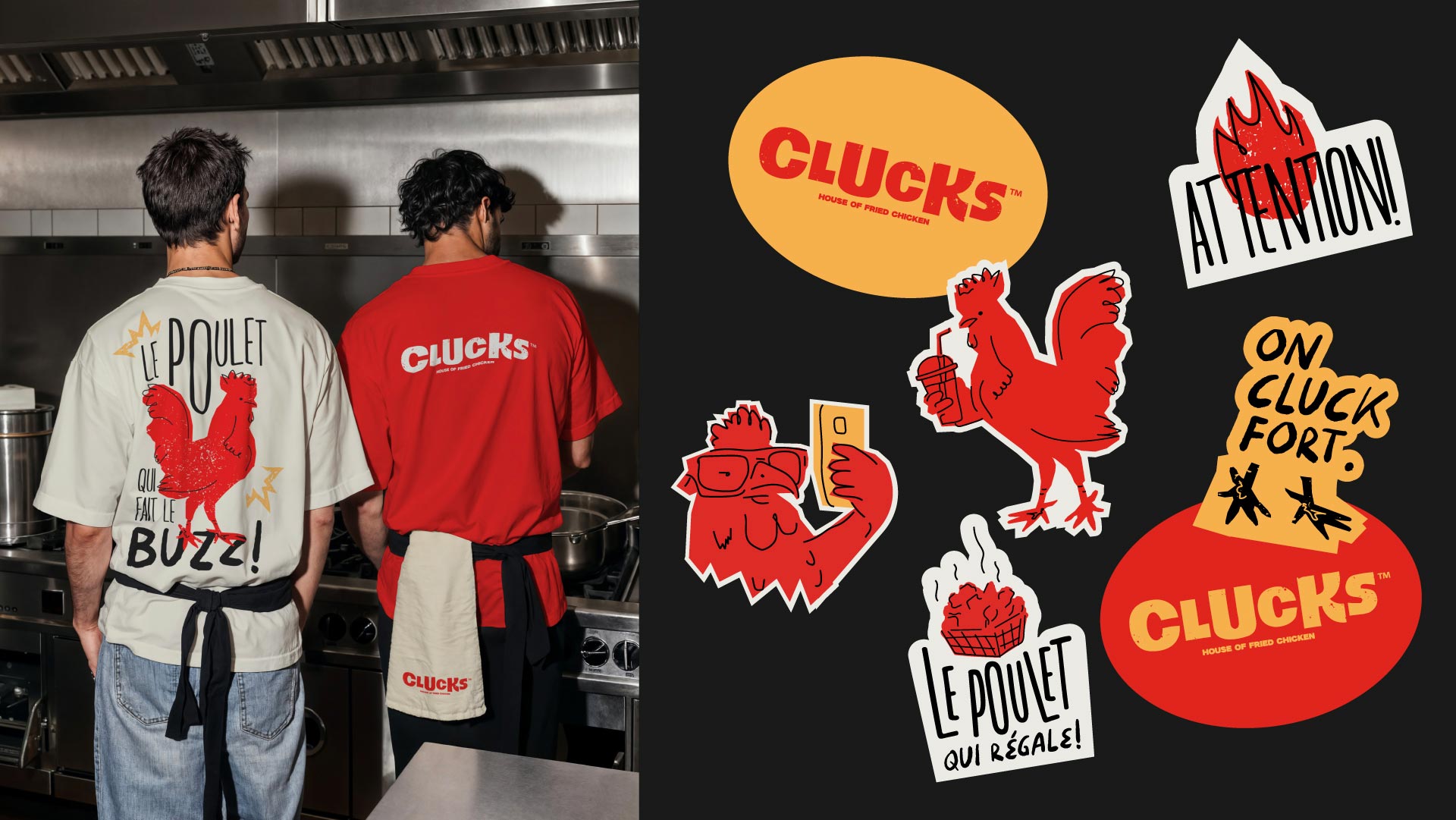
Kook developed the brand identity in collaboration with Menu Mechanics, translating the concept into a bold, vibrant visual language. The central idea is that language itself is part of the design. Bilingual communication in French and English is built into the identity as a graphic element, so words work as visuals and the brand speaks to its audience in both languages at once. The identity is accessible yet loud, a combination designed to stand out in a market still discovering this kind of concept. Logo design and illustration give Clucks a playful personality with attitude, matching the way the food is served. A vivid color palette and repeatable patterns keep the system energetic and easy to recognize at a glance. The result is a brand that feels young, confident, and built for sharing, designed to give a new chicken concept a loud, memorable start. Nothing about it whispers.
The Experience
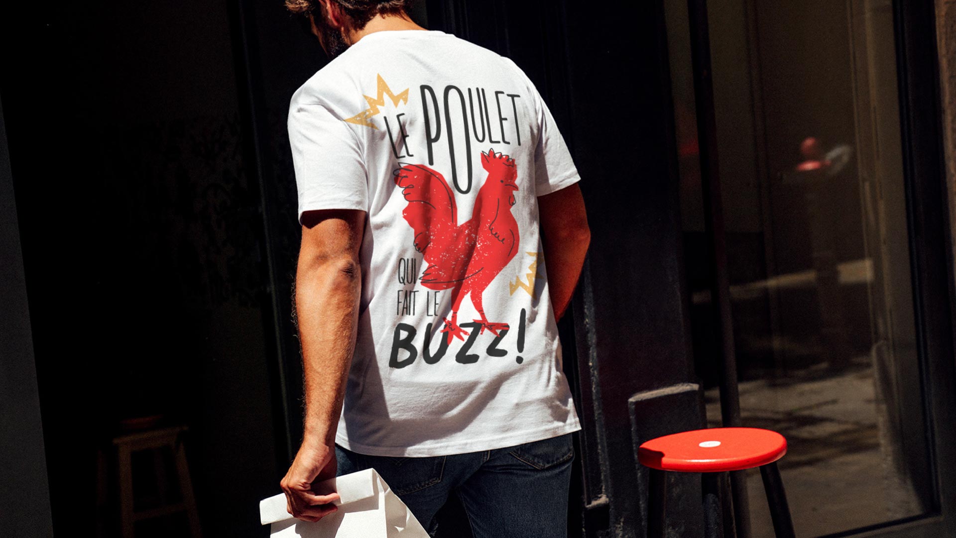
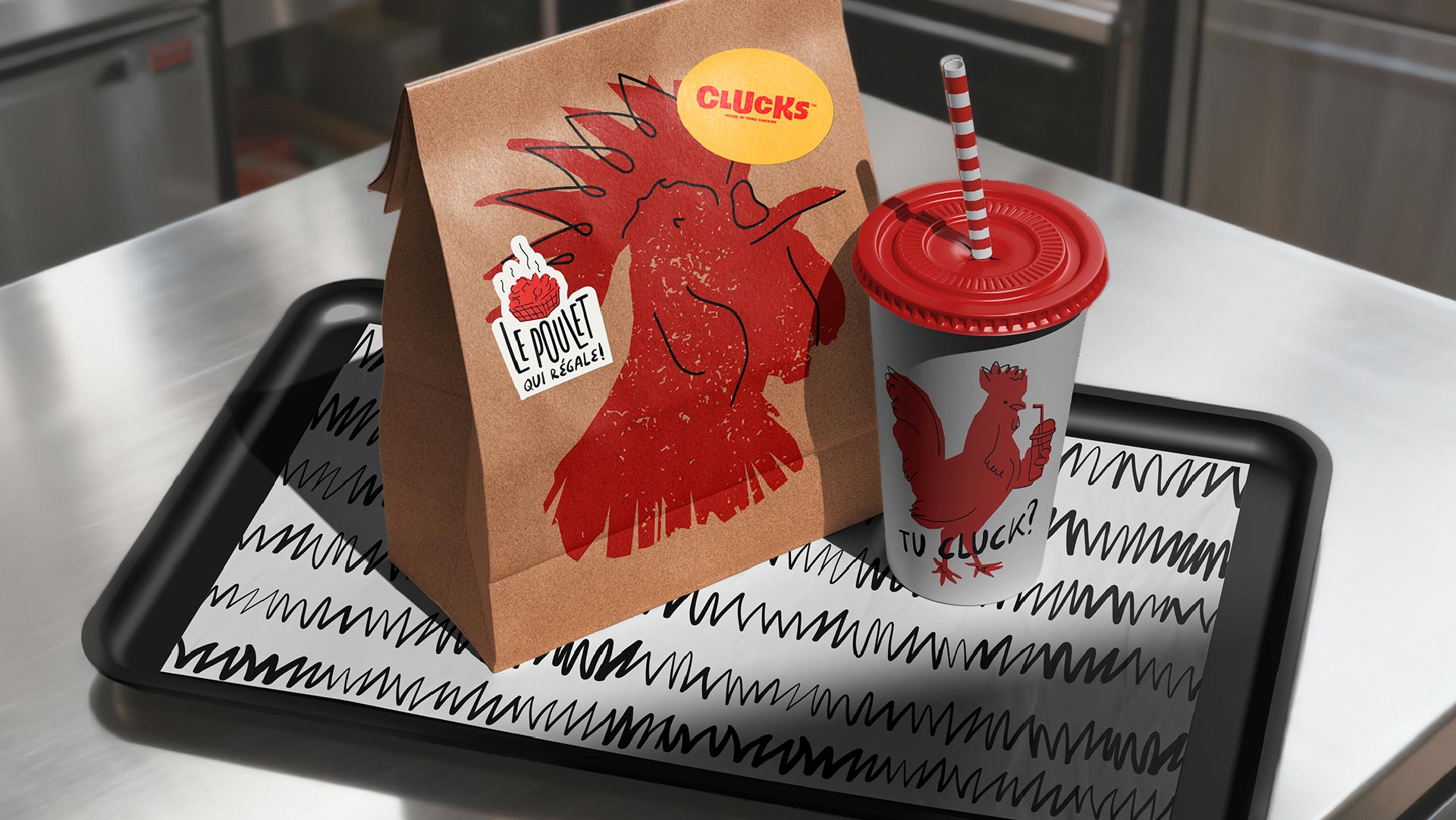
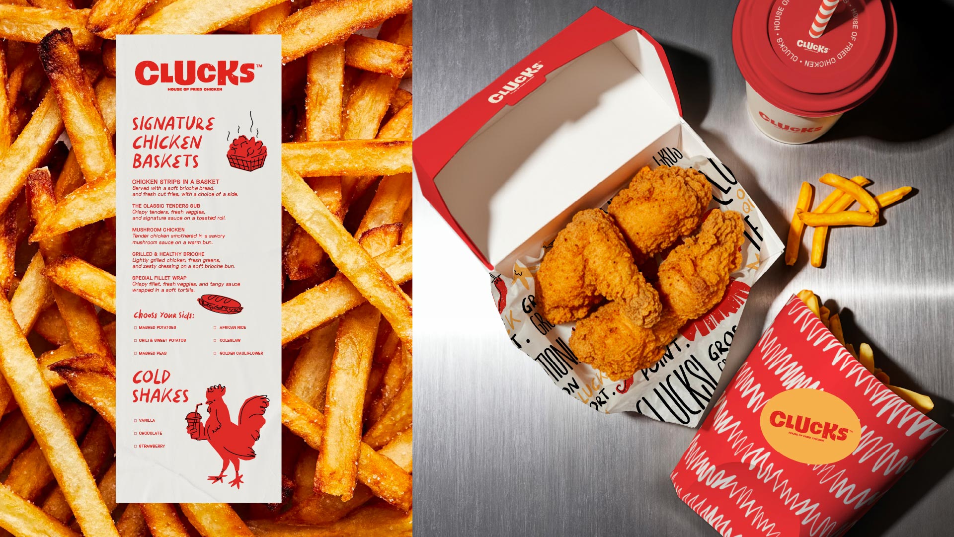
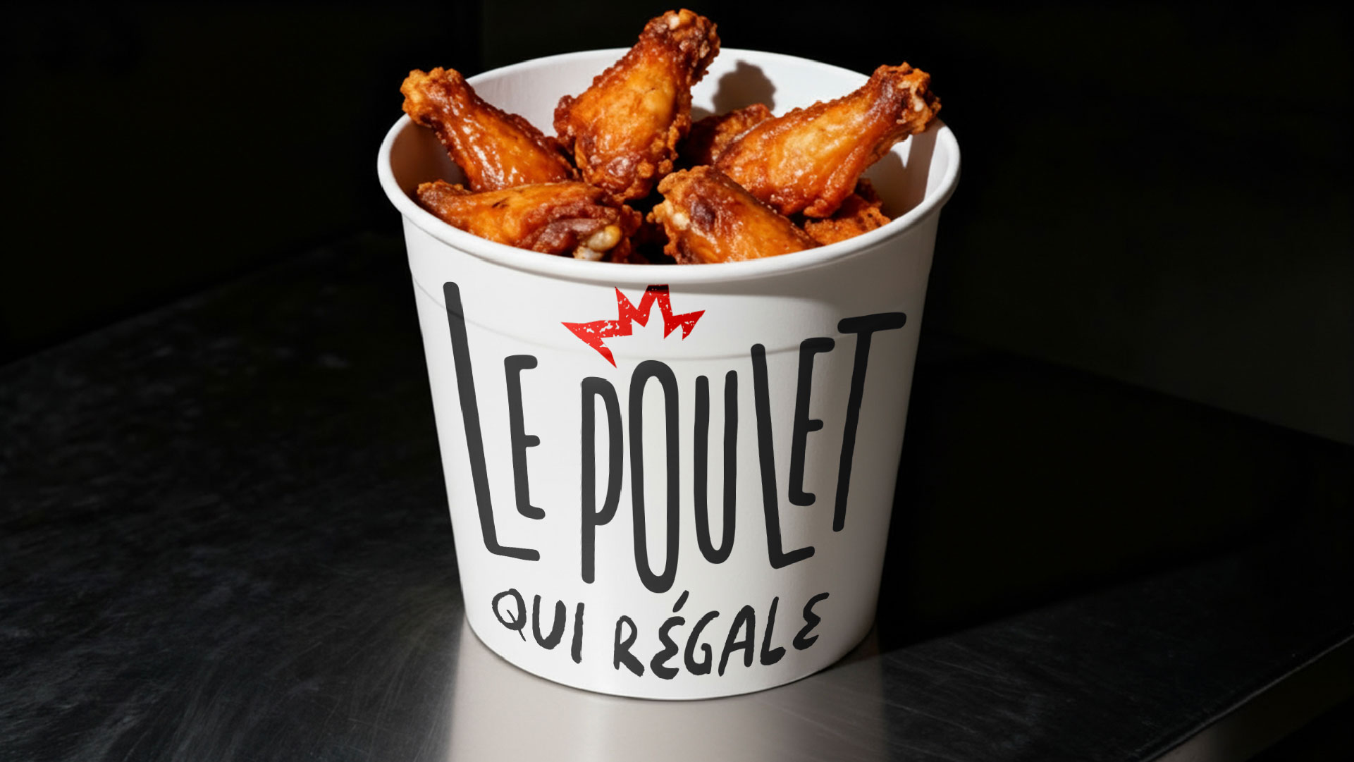
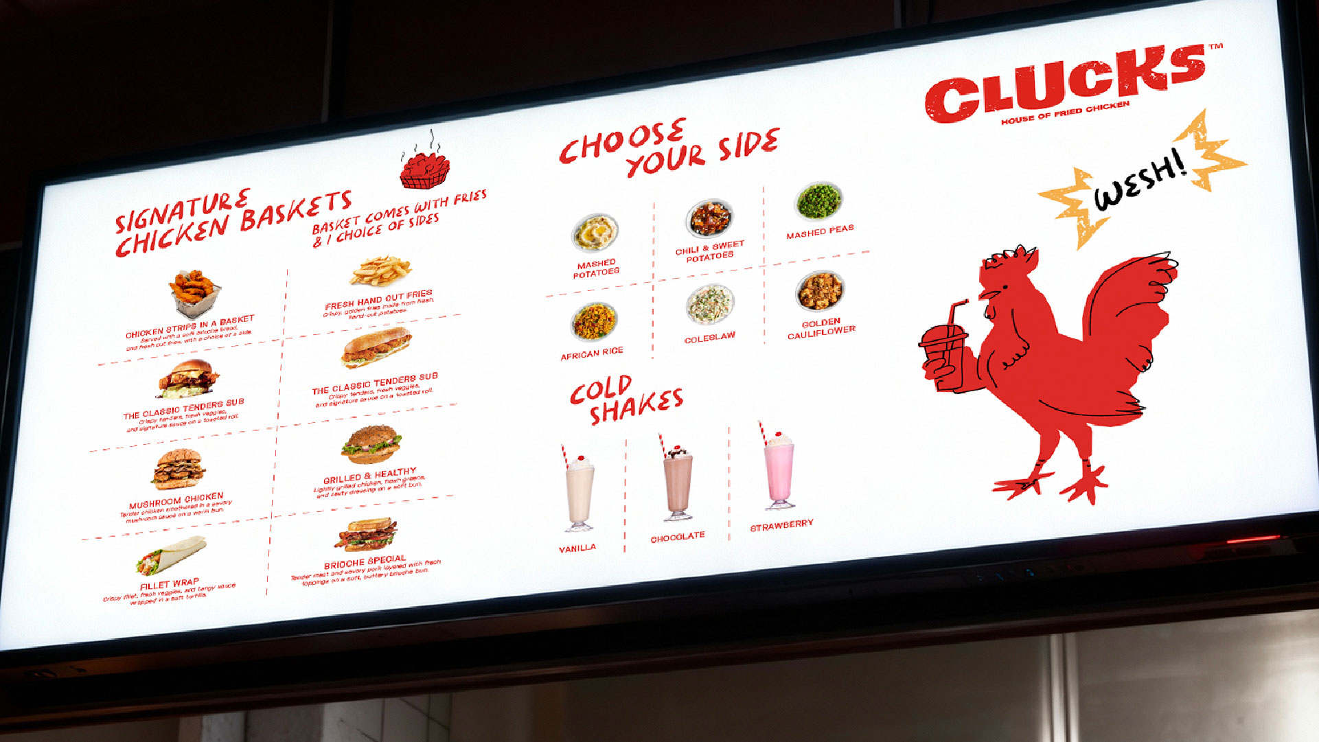
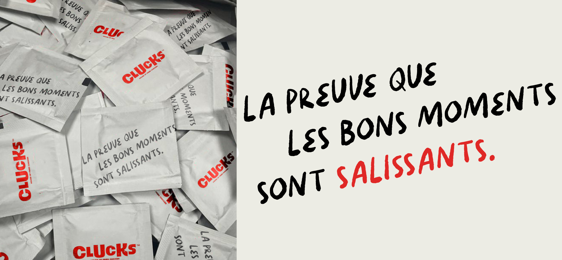
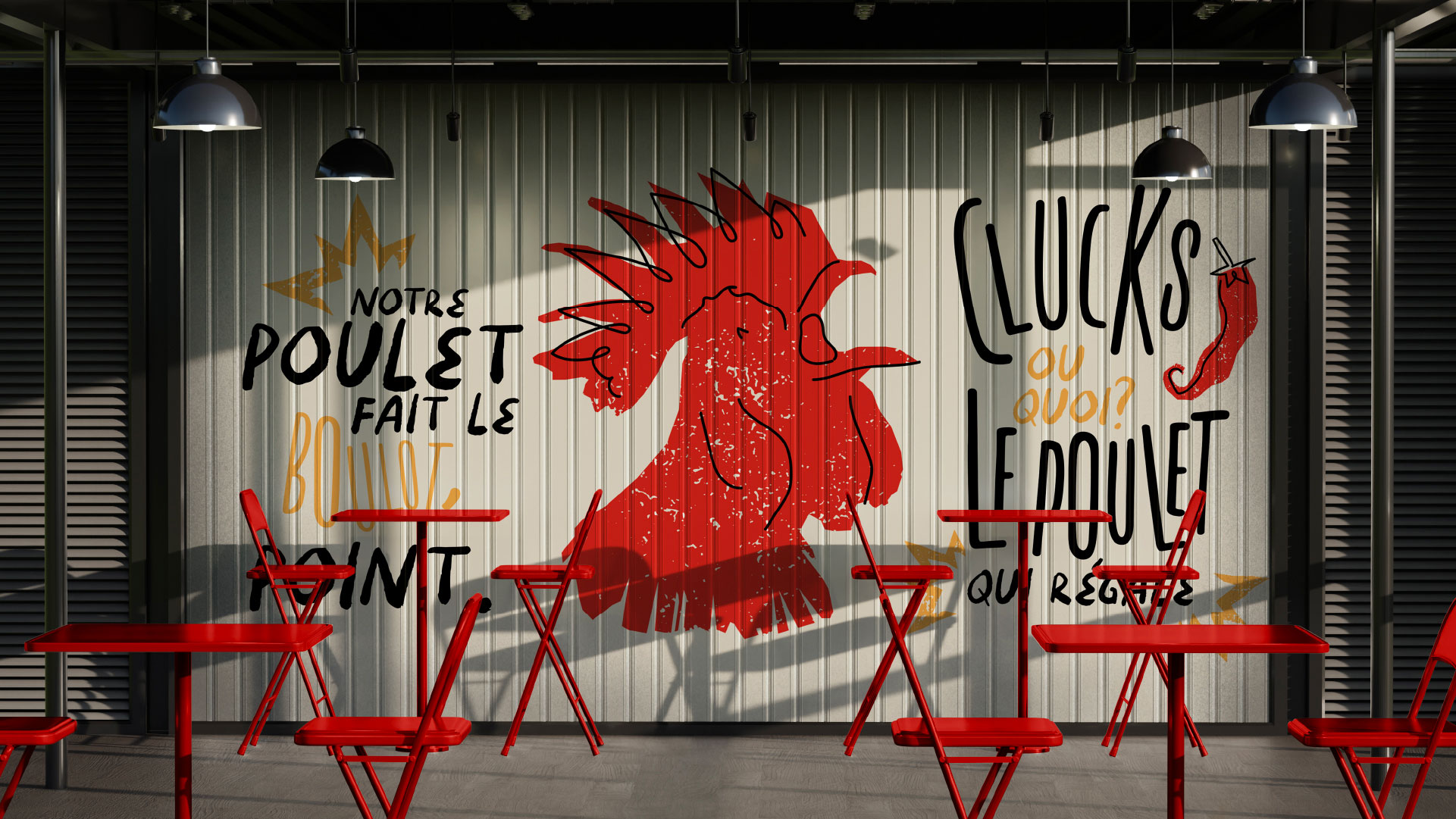
Packaging turns the identity into something customers hold. Kook designed fresh, bold packaging for Clucks, from buckets and trays to napkins, applying the same colors, patterns, and bilingual copy everywhere. The identity also extends to wall graphics, menu screens, and T-shirts. Each piece is designed to be seen, photographed, and shared, because a loud brand earns attention in the places customers already spend time. The sauce station is part of the experience, with branding that invites guests to dip, shake, and enjoy. Bilingual copy runs across every surface, keeping the tone consistent in French and English, loud in both. The result is a complete, cohesive brand experience that makes Clucks feel like a destination rather than a menu. From the first bite to the last napkin, every detail reinforces the same idea: this is not just another chicken spot. Clucks is built to be remembered, repeated, and shared.
Clucks Fried Chicken project gallery