IRAP
A contemporary visual identity for an association that has marked the social Lebanese landscape since its inception more than 65 years ago.
Project story
A Home That Keeps Growing
The Challenge
IRAP is an association that has marked the social landscape of Lebanon since its inception more than 65 years ago. Its social mission is supported by income-generating activities, including its pastry and frozen-product lines. During Lebanon’s economic crisis, strengthening those product lines became a priority. At the same time, IRAP’s communications had to be reorganized so the association could speak clearly to customers, supporters, and donors. Export activity added another layer. Selling to foreign markets demanded a clearer, more scalable identity, one that could carry the association’s story and its products beyond Lebanon. The challenge was to modernize a respected, long-standing institution without losing the trust built over six decades. Each product, document, and digital touchpoint needed to work as part of one system, whether it reached customers at home or abroad. That brief called for strategy before design, and for a partner willing to stay the course.
- Client
- IRAP
- Year
- 2022
- Industry
- Food & Beverage, Education & Social Impact
The Approach
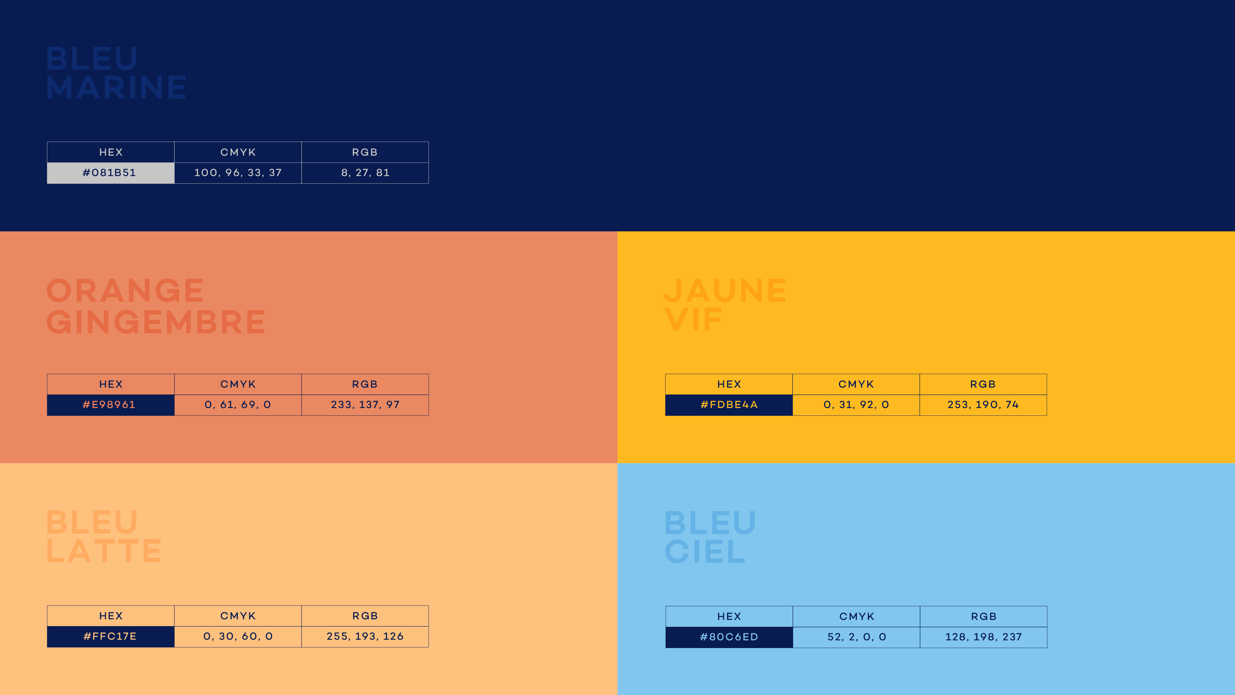
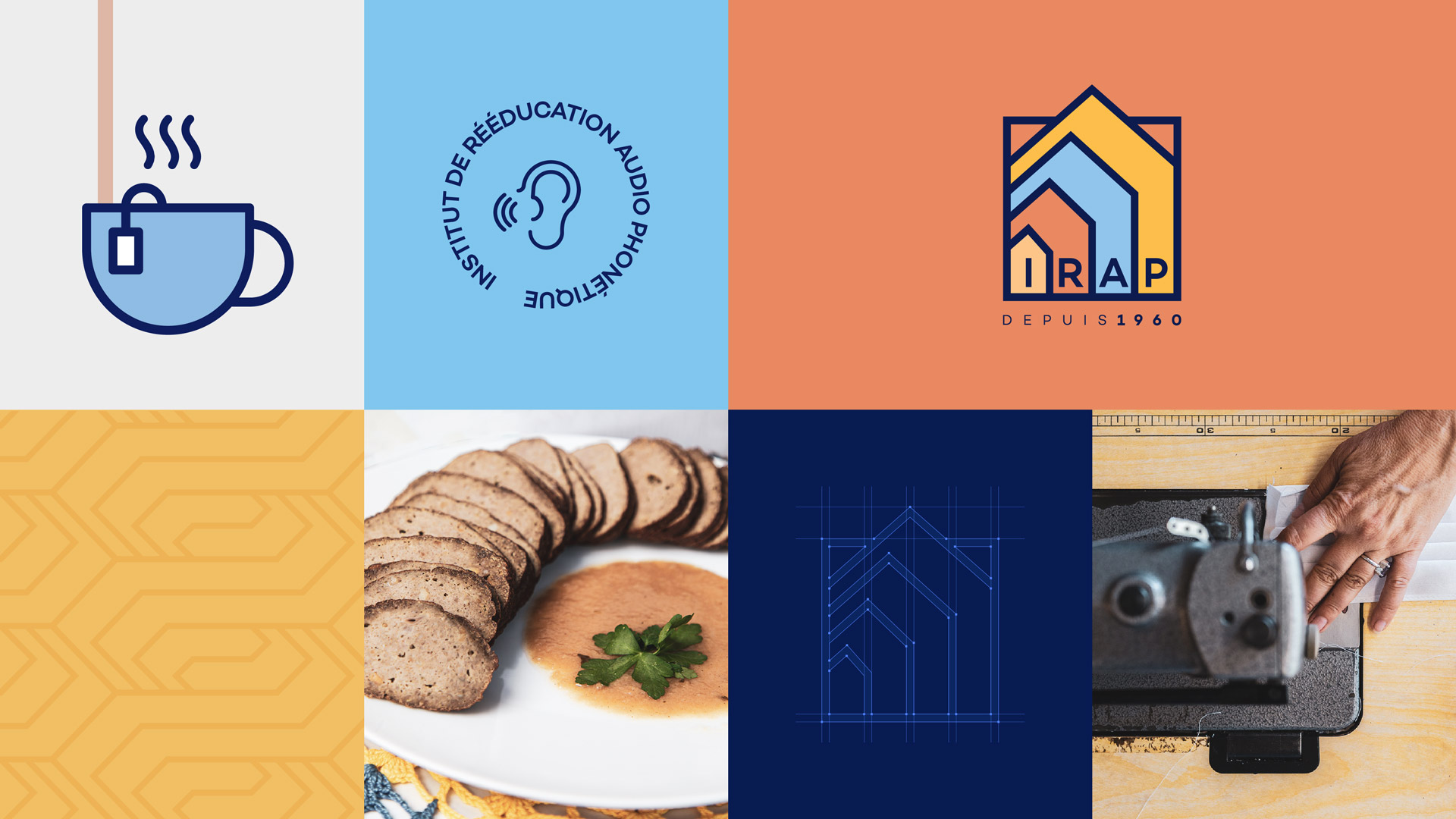
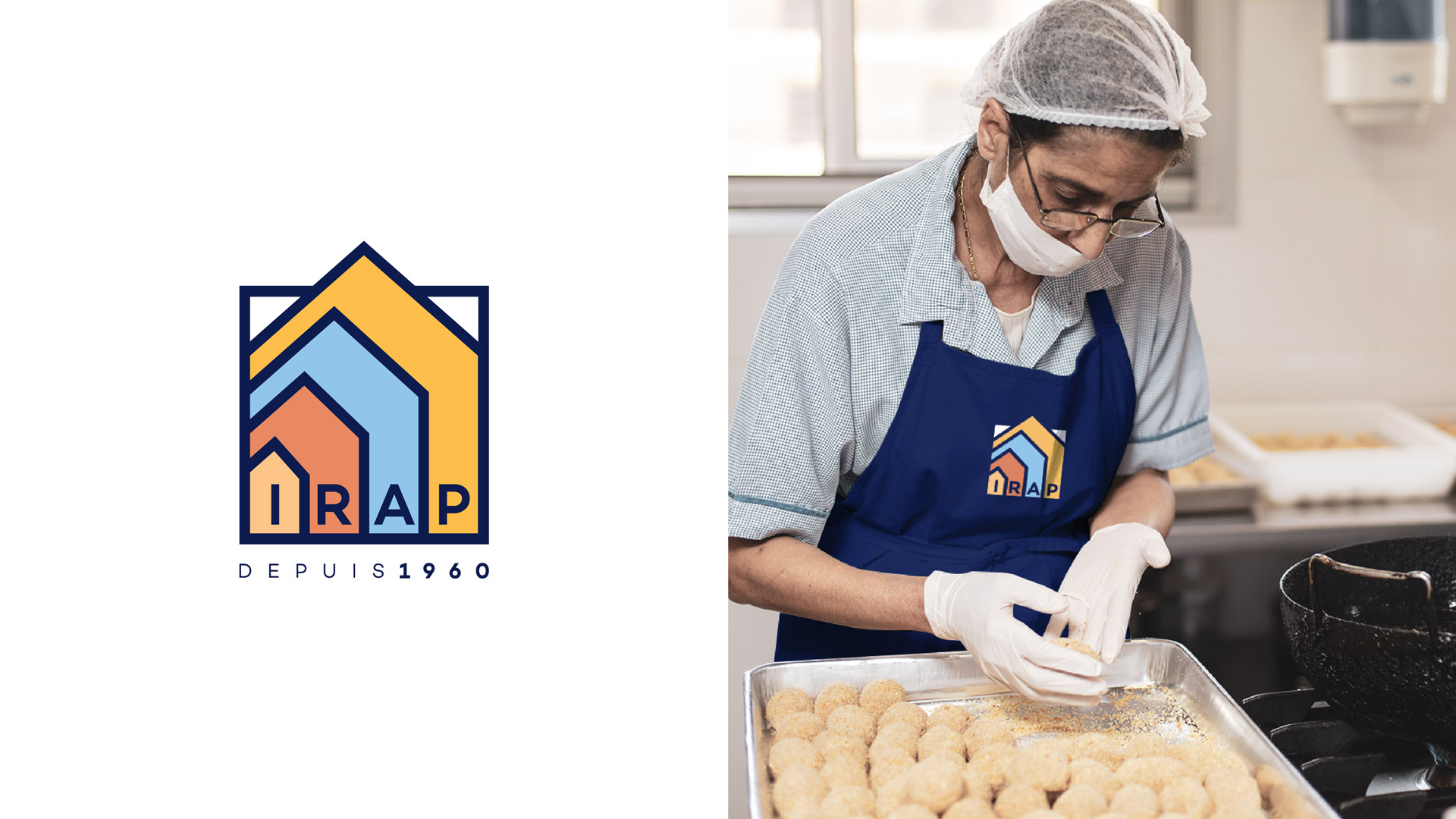
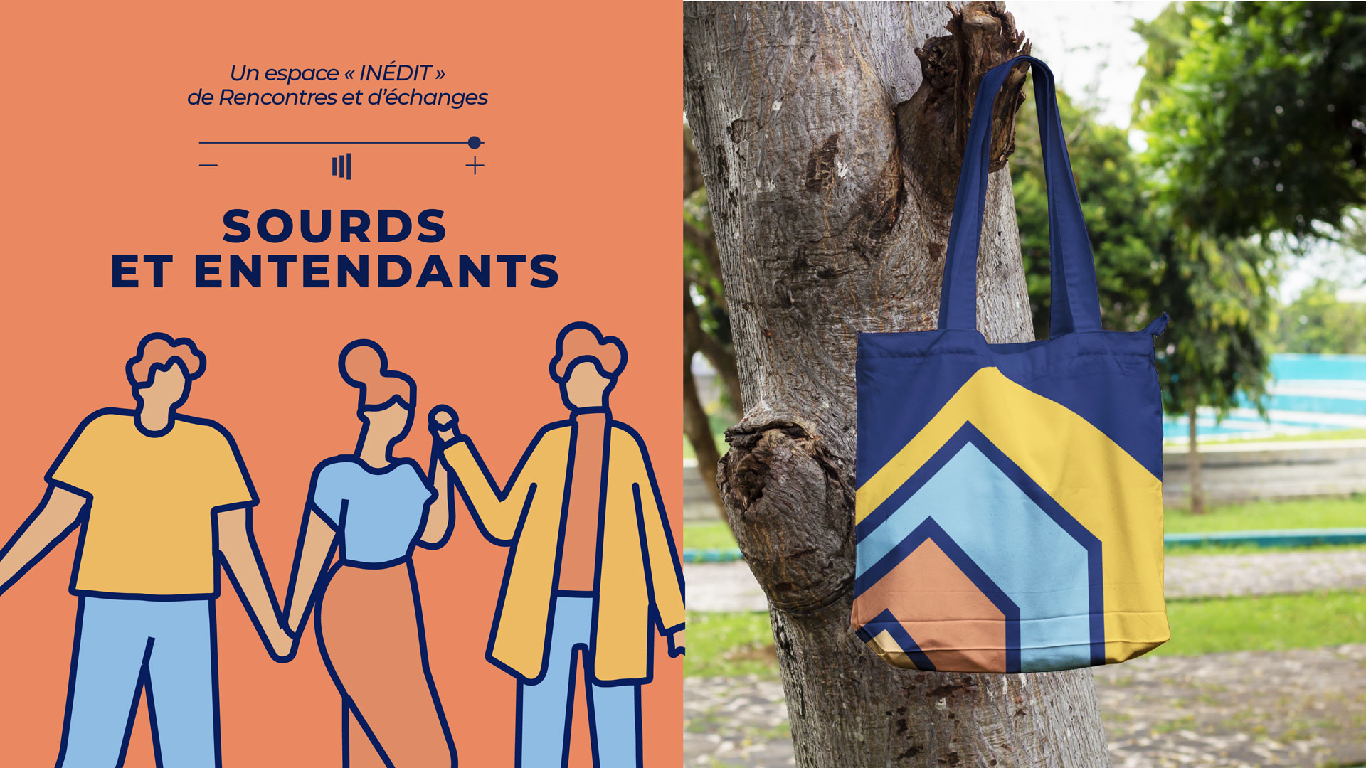
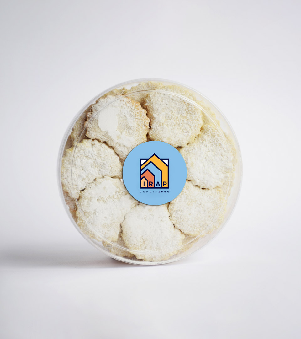
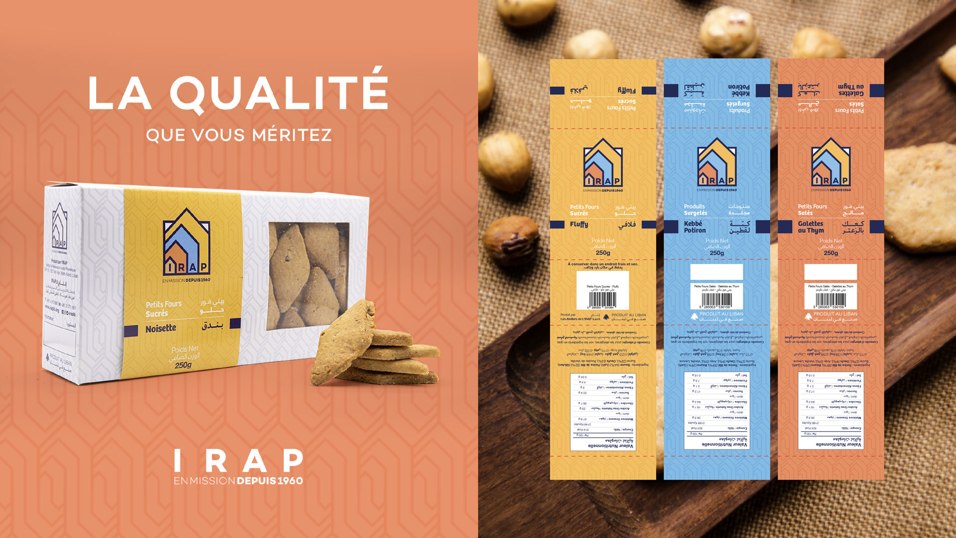
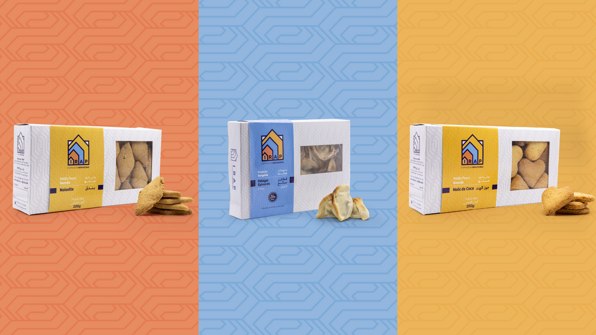
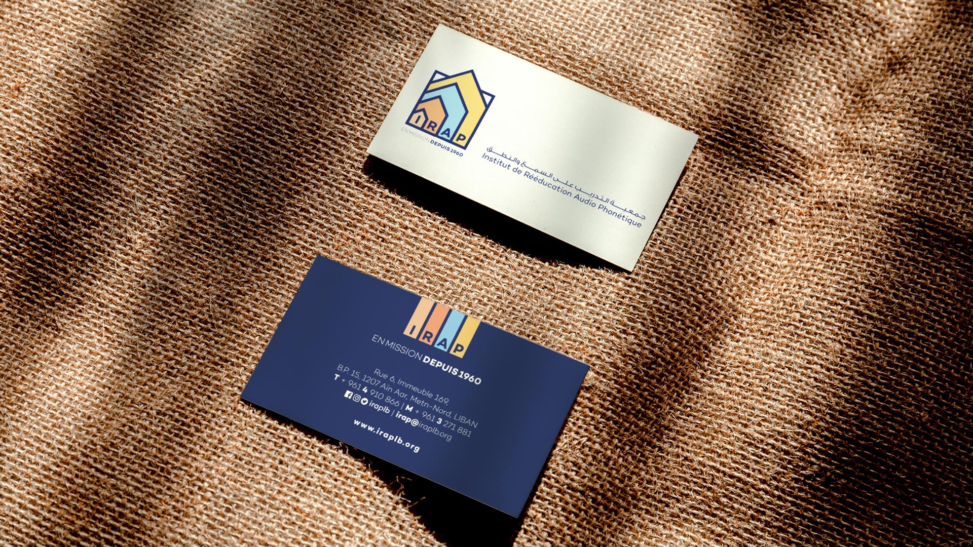
Across a three-year partnership, Kook stayed alongside IRAP as the work moved from strategy to execution. A core part of the work was reorganizing IRAP’s marketing communications approach, defining how the association presents itself, to whom, and through which channels. Kook also refreshed the institutional identity, giving a six-decade-old association a contemporary look and a logo built to scale. Product packaging was redesigned for the pastry and frozen lines, so the products that support the mission carry the same visual language as the institution behind them. The system was applied across physical and digital touchpoints, including print design, a website, and motion graphics. Every format follows the same rules, so a leaflet, a pack, and a web page all read as IRAP. Working over three years allowed the system to mature through real use rather than a single launch. Consistency, clarity, and scalability guided every deliverable, from logo to label.
The Result
The new system strengthened IRAP’s positioning as a modern, credible institution with a clear social mission. Its pastry and frozen products now carry a consistent, professional presence that supports both local sales and export. The clearer, more scalable identity opened opportunities in foreign markets, giving IRAP a credible way to introduce its products and its story to new customers abroad. The refreshed institutional identity also supported the association’s efforts to attract new donors, presenting a long-standing organization with the clarity and professionalism that donors look for. Because income from the product lines supports the social mission, stronger branding feeds directly into the work IRAP does. Started in 2022, the project shows how design can serve an institution through a difficult economic period. It also shows how a social organization can carry its heritage forward without standing still. For IRAP, the home keeps growing, and the brand now grows with it.
IRAP project gallery