Vy Honey
Brand identity, packaging, and web for a Lebanese honey brand rooted in ethical beekeeping.
Project story
Honey Rooted in Nature
The Origin
Vy Honey began as a couple’s personal journey, driven by a passion for nature, wellness, and tradition. That passion led them to beekeeping in the mountains of Lebanon. What started in 2016 with a few hives for family use has grown into a sustainable, ethical venture producing high-quality products. Environmental commitment sits at the center of the business. Vy Honey selects safe plant habitats to protect its bees and promote biodiversity, and its efforts support environmental conservation and community education. The goal is to preserve the balance of the ecosystem the bees depend on. Kook’s task for Insula was to translate this story into a brand that carries it clearly. The challenge was to express a small, family-rooted operation with premium credibility, so customers understand both the quality of the product and the values behind it. Authenticity became the guiding principle for every decision that followed, from color to illustration.
- Client
- Insula
- Year
- 2025
- Industry
- Food & Beverage, Retail, Fashion & Consumer
The Identity
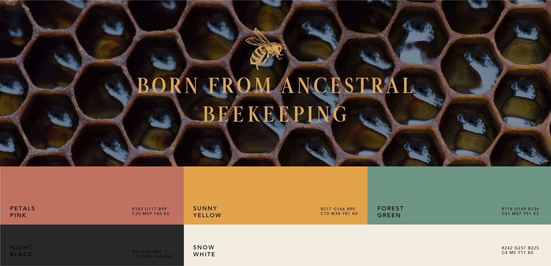
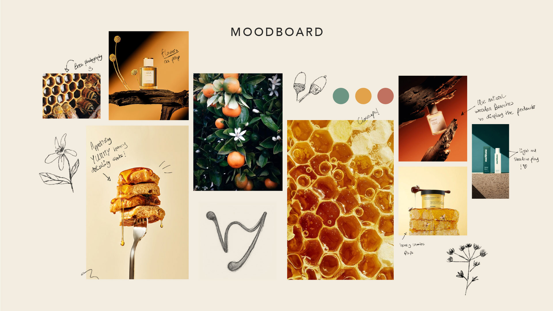
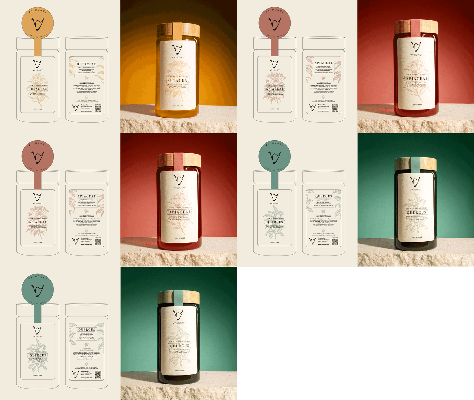
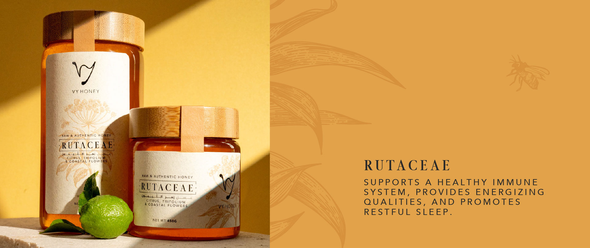
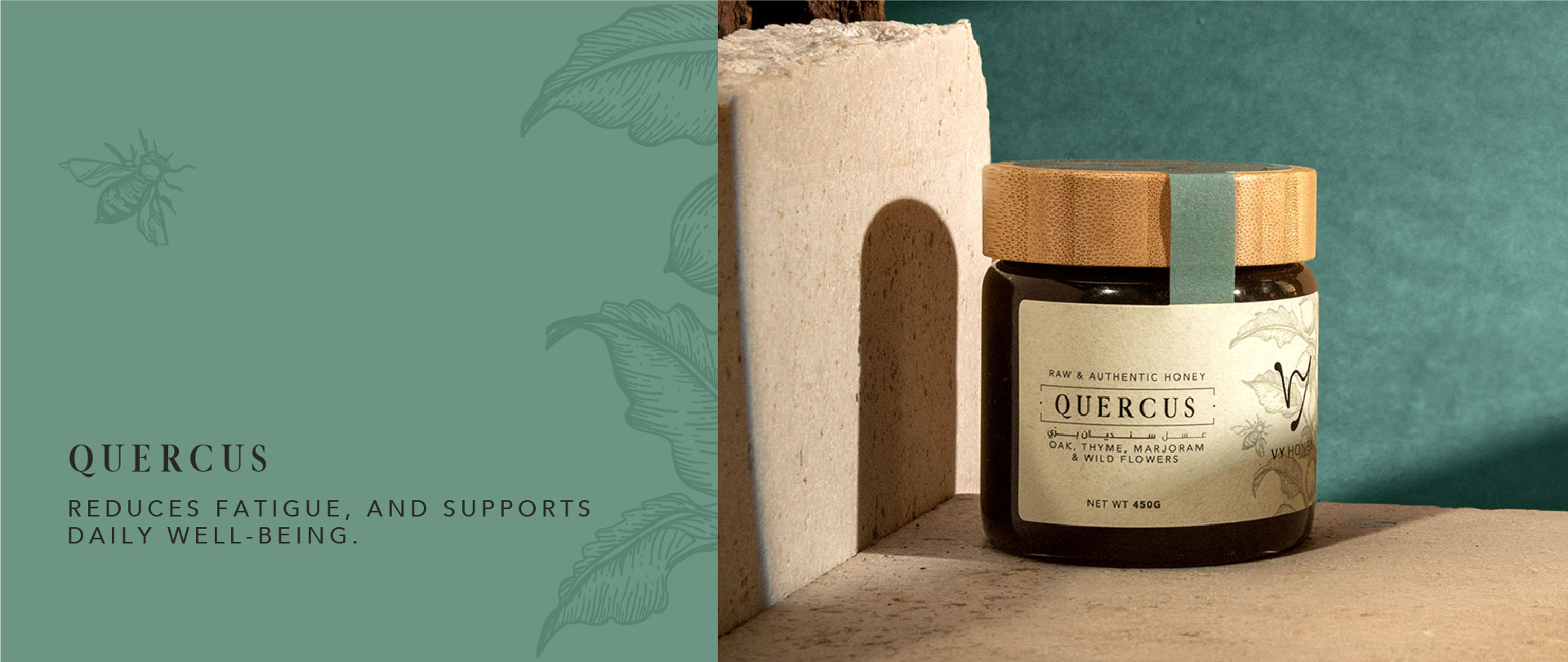
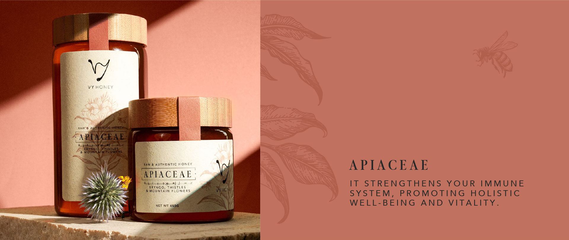
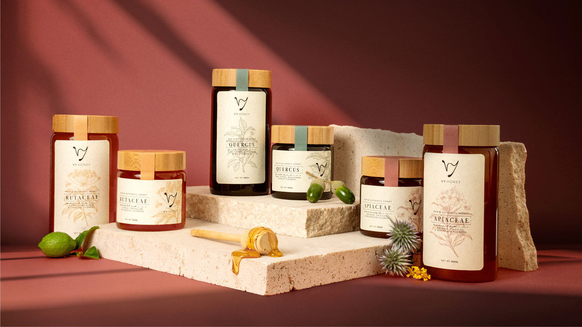
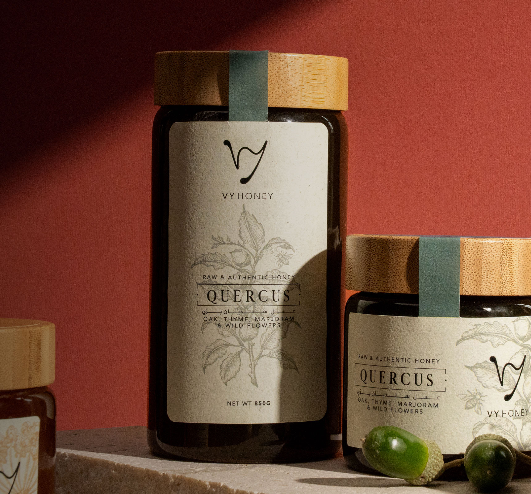
Kook developed the identity through meticulous refinement, ensuring the final result resonated with the brand’s core values. The identity centers on authenticity. Earthy, warm tones create a visual language that feels both premium and deeply connected to nature, echoing honey, wax, and the mountain landscape where the hives sit. Hand-drawn illustration adds to that authenticity and brings visual richness, relinking the brand to nature in a way a purely digital approach could not. The logo was designed as part of a cohesive look, so the brand reads as pure, high-quality, and trustworthy wherever it appears. Logo design, art direction, and illustration work as one voice. Nothing feels decorative or manufactured. The brand looks like what it is: honey made with care by people who know their bees. The result sets Vy Honey apart from generic honey labels, positioning it as a premium, nature-led brand in the Lebanese food and consumer market.
The Experience
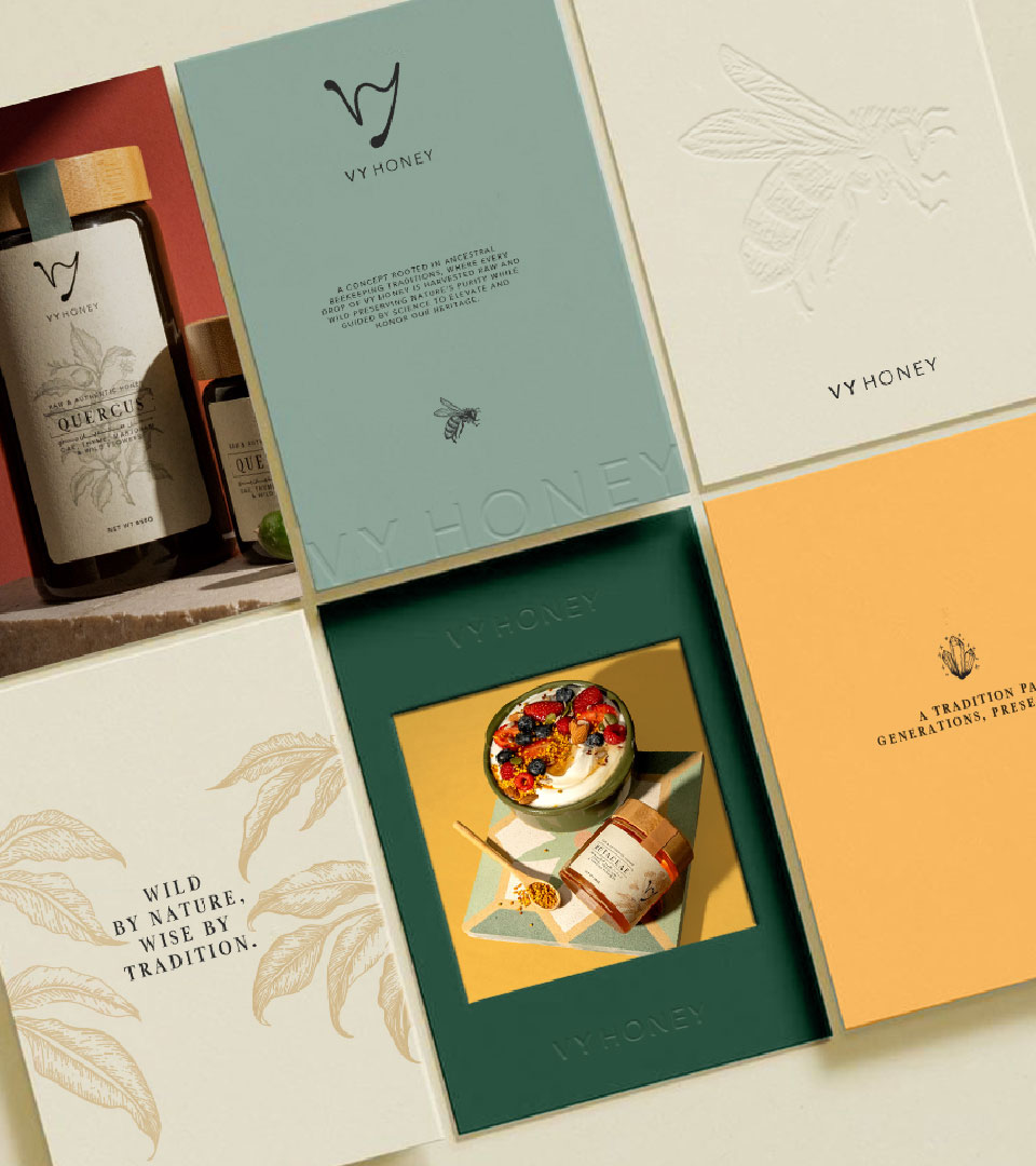
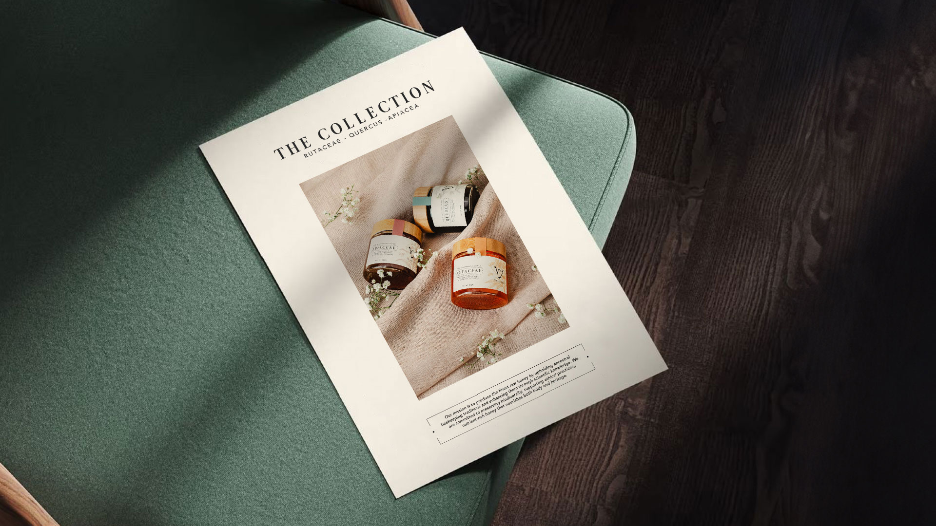
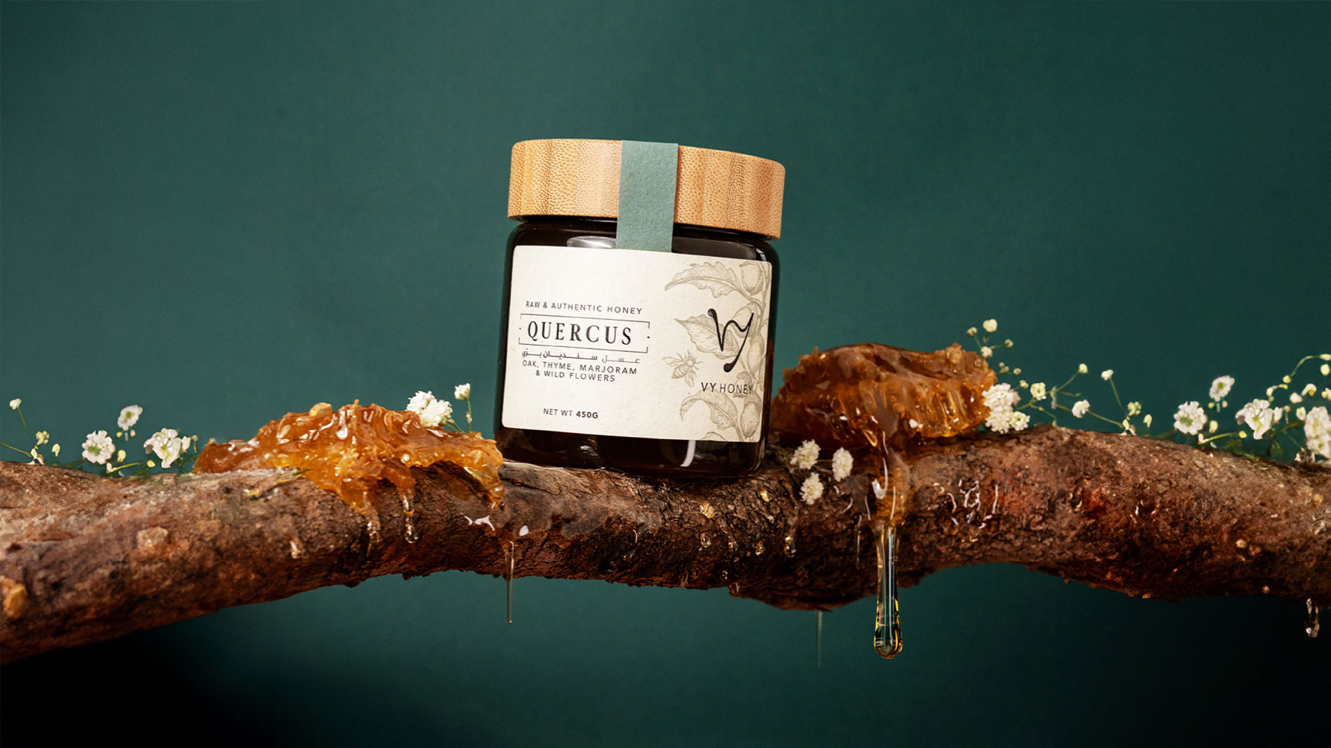
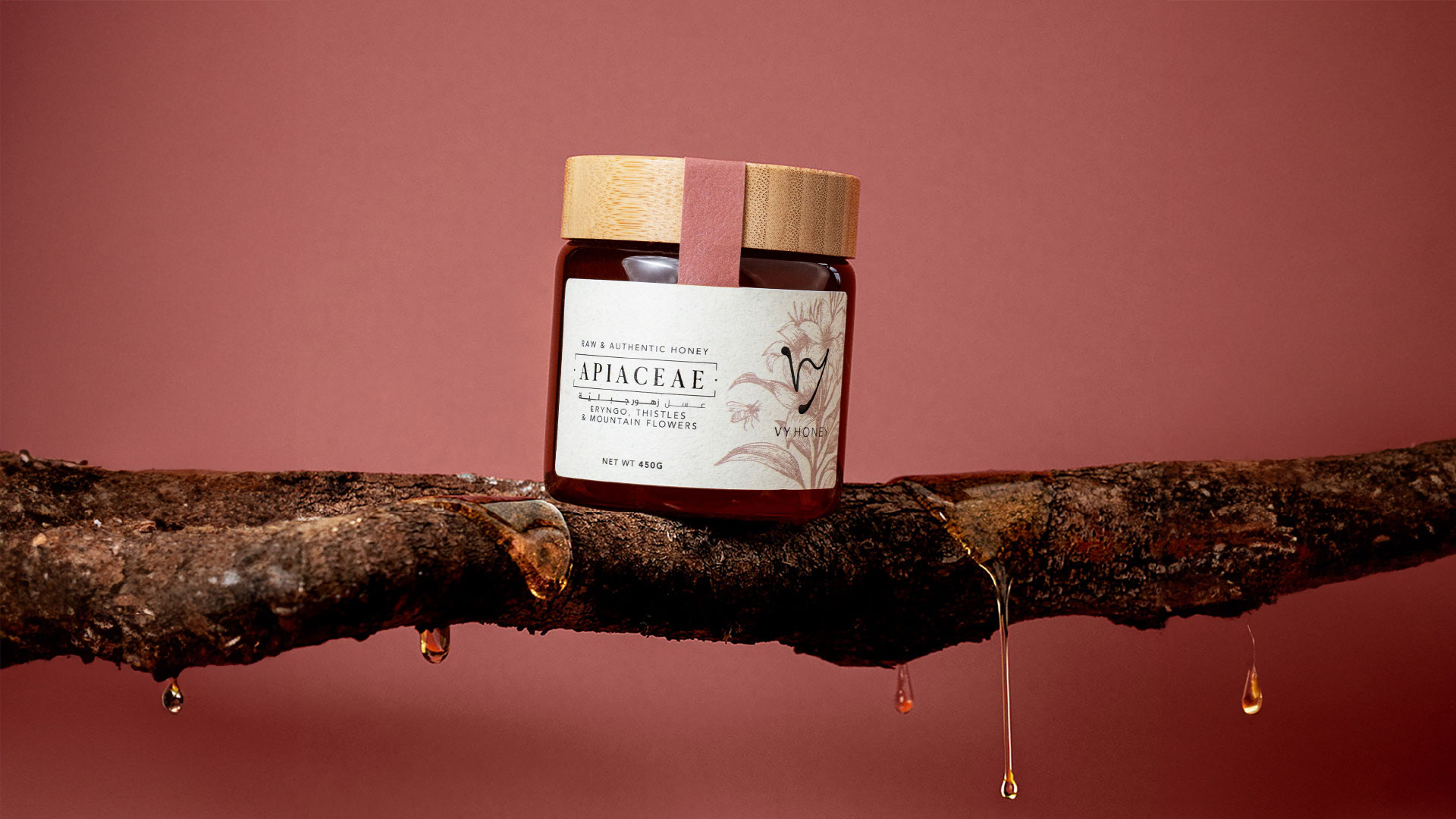
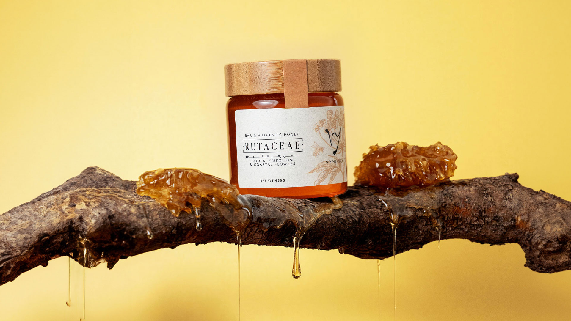
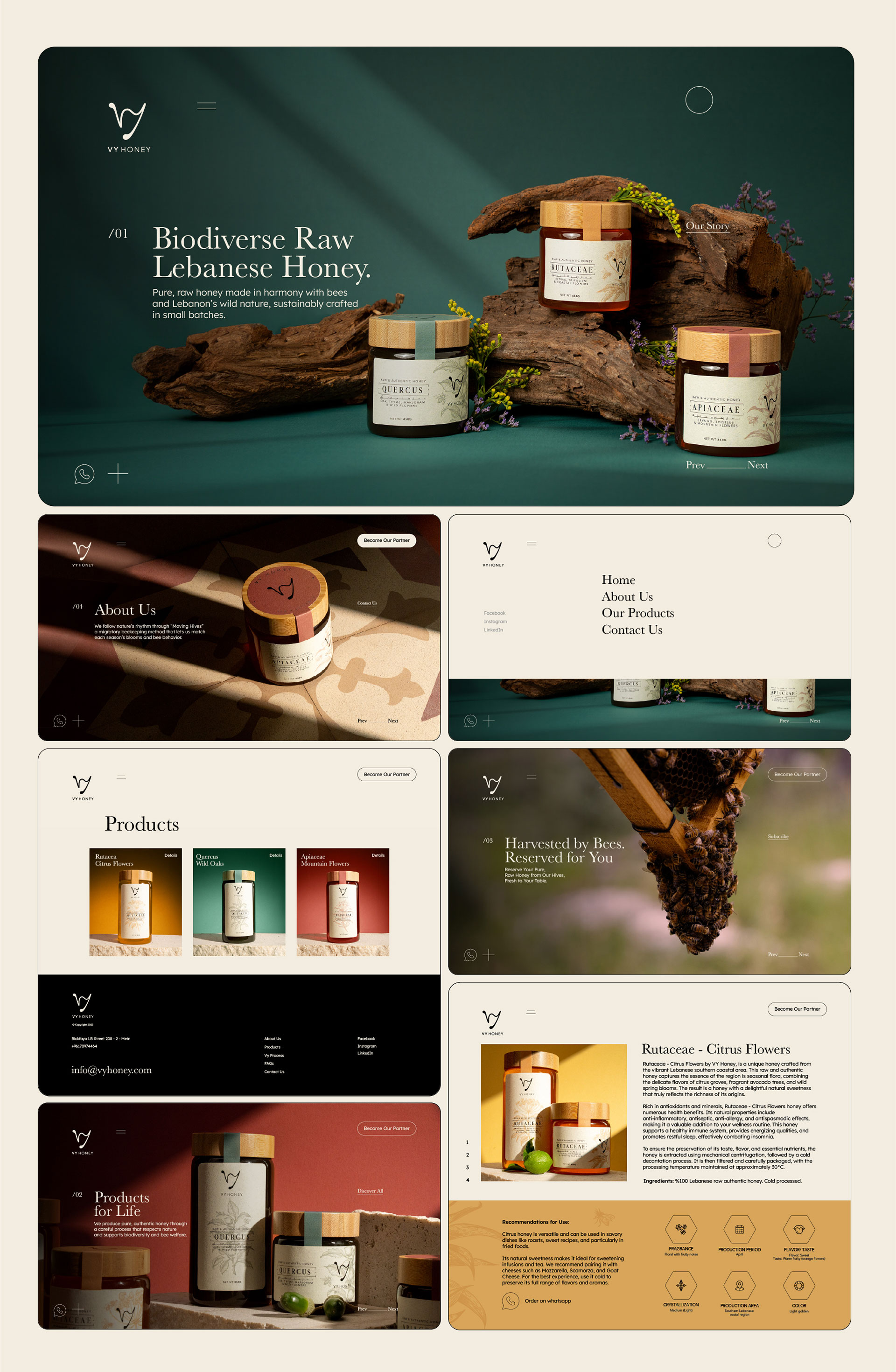
The identity extends across every touchpoint where customers meet Vy Honey. Kook designed the packaging, print materials, and website, and added 2D animation to bring the brand to life on screen. Each format carries the same earthy palette and hand-drawn illustration, so the brand feels consistent from shelf to screen. Packaging does the most work, because honey is bought on trust. Natural tones and illustrated details signal origin, care, and quality at a glance, helping Vy Honey stand out among shelf competitors. The website gives the story room to breathe online, connecting the product to its beekeeping roots and environmental commitments. Motion adds movement and personality, making the brand feel alive in digital contexts. Together, these pieces give Vy Honey a complete brand system that is premium, ethical, and rooted in nature, ready to support growth far beyond the first family hives. Harvested by bees, reserved for you.
Vy Honey project gallery